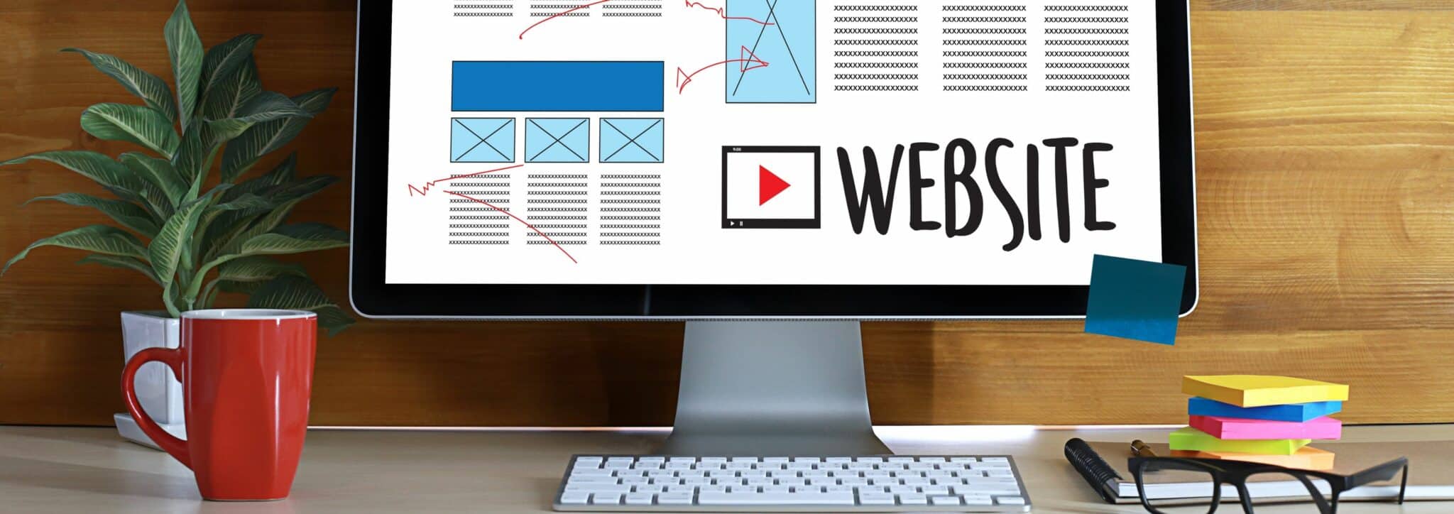
These two components must work together to create a coherent website that does not leave users frustrated. The article below describes how UI UX design can be used to increase conversions and improve customer satisfaction for your e-commerce business.
User interface (UI) and user experience (UX) design are the two essential elements that make an e-commerce site successful. It’s the first, and perhaps only, reason why a user will stay on your site or turn away.
User interface design is everything that is visible to users on an e-commerce site. This includes the color palette, typography, imagery (if used), the layout of elements such as buttons and text boxes, as well as animations. A good design is invisible. Nothing on the site should distract the user from their information-gathering process. Whether it’s searching for items to buy, product reviews, or using the site itself.
User experience has been defined as “a person’s emotions and attitudes about using a particular product, system, or service”
UI Design is the user interface, the first thing your visitors will see and interact with. A site’s design should be simple, intuitive, and easy to understand for users who may have no prior experience with e-commerce sites. This can prevent them from abandoning their cart before making a purchase simply because it was too difficult to navigate the site.
UX Design is the design of the user experience that focuses on how people feel when using a site. Often, UX is divided into three categories: usability, desirability, and the overall emotional response of users to your site’s interface.
A good e-commerce site should be characterized by intuitive navigation, ease of use, a clean layout, and clear calls to action. The design should be simple and easy to understand for visitors, so that they feel confident using your site.
To create a good user experience on an e-commerce site, the user interface design must be excellent. It is essential to understand the needs of users to create the best possible website and make customers want to come back. By using both UI and UX design, the effectiveness of your e-commerce site will increase dramatically.
A good user interface design should be invisible to users who intend to use the features of an e-commerce site. The layout should draw attention where it is needed. Whether it’s encouraging visitors to search for product information or prompting them to take action with a clear CTA button.
Making a good first impression is essential for an e-commerce site, and it starts with UI/UX design. A combination of these two design elements will bring out the best in your site.
The key to good UI/UX design is understanding the needs of users and how they want these needs presented on an e-commerce site. This means knowing who your target audience is, researching similar sites for inspiration, favoring simplicity in all areas of the site (from navigation to checkout), etc.
A good user interface design should be simple enough for visitors to easily find information, yet intuitive enough so they are not overwhelmed by features or options. The goal is to make a good first impression on customers rather than bombard them with too much at once!
A well-designed product page should include clear images related to the item being sold, as well as high-resolution photos so customers can get a good idea of what they are buying. The product description should be easy to read and understand, answering any questions customers may have about the item or reasons to buy (such as durability or weather resistance).
Make sure your product pages include multiple calls to action encouraging visitors to look at other products you offer or contact customer service if needed. Website design should also include an “About Us” page containing information about the company and its policies, allowing users to know who their money is going to when making a purchase!
The goal of UX design is essentially to analyze user behavior on your ecommerce site in order to improve existing areas or create new features.
This infographic breaks down how each element of this important duo can help you get more conversions on your website.
